
2025-2026
Reimagining how a university department communicates its research, teaching, and impact
the challenge
The department's website functioned as a static information hub rather than a recruitment or engagement tool. It served visitors who already knew what they were looking for, but failed the audience that mattered most: prospective students trying to evaluate whether a Geography degree was right for them.
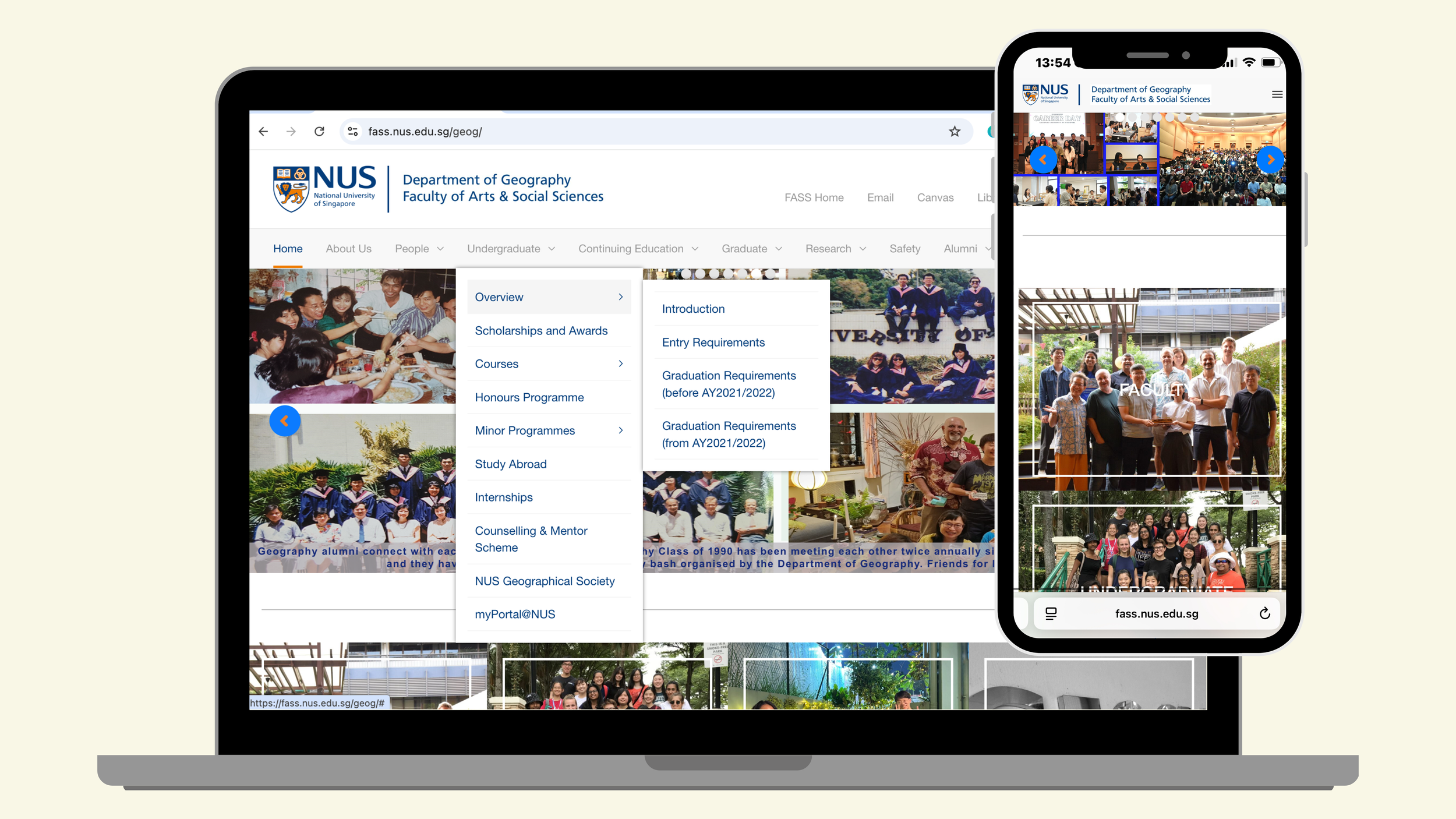
Four main problems stood out.
01 No clear entry points: an overwhelming navigation structure with no landing pages, forcing visitors to already know what they wanted before they could find it
02 Weak information hierarchy: flat and text-heavy pages with minimal visual structure to guide attention
03 Poor mobile responsiveness: a significant gap given mobile phones are students' primary browsing channel
04 No answer to the core decision-driver: the site could not address the one question every prospective student actually has: what can I do with this degree?
the solution
01 Landing pages: a clear entry point for every major section, reducing the reliance on prior knowledge to navigate
02 Sidebar navigation: lowering cognitive load in content-dense areas by giving users a full map of the section at a glance
03 Card-based content: replacing static text blocks with quick, scannable and browsable formats
Three principles anchored the redesign.
Together, these principles turned it into a site built for exploration.
the process
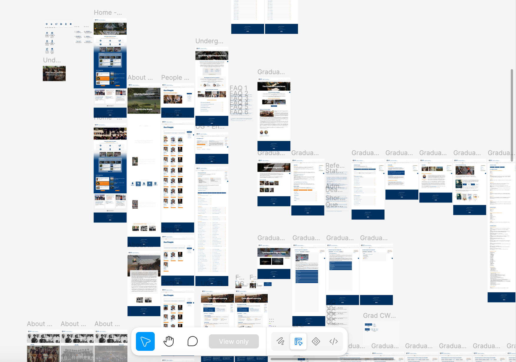
An end-to-end revamp: stakeholder alignment, content architecture, and interactive prototyping, restructuring the site in full and integrating input from 20+ academic and administrative stakeholders.
Content was sourced directly from the faculty and staff responsible for each programme and research area, ensuring that the site remained accurate and reflected the department's collective voice rather than a single interpretation of it. Managing that many stakeholder inputs required a consistent framework for reconciling differing priorities across programmes while keeping the site's overall structure coherent.
Before committing to a full build in WordPress, I developed a fully interactive prototype in Figma so faculty and staff could test the new structure the way a prospective student would. This allowed any gaps and misalignments to be surfaced early, reducing any big rework once the actual build began.
Every design decision was made within NUS's existing brand and web guidelines, requiring a balance between improving the user experience and preserving institutional consistency.
the outcome
~3.8K new users* within three weeks of launch
+6% vs. the prior period, with strong sustained engagement (~1m40s average session time). These early results suggested the restructured site is succeeding at its core objective: making the department's research and programmes more discoverable, and more relevant to the target audience.
Critically, the underlying design logic (clear entry points, reduced cognitive load, scannable structure) was applied consistently across every section of the site. The result is a coherent system, not a set of isolated fixes, allowing for the same approach to be extended to future content and programmes without requiring a redesign each time.
*data obtained from Google Analytics